Visualizing Convolution Kernels
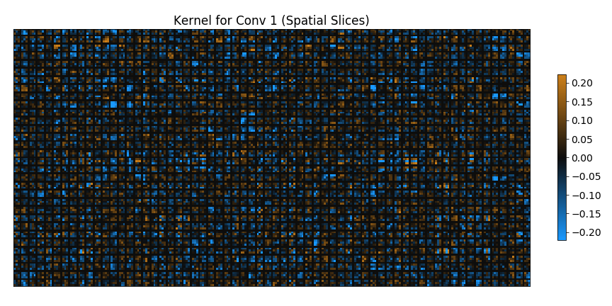
I very rarely see any sort of inspection being done on the convolutional kernels of a CNN. In part this is because the parameters themselves are far more difficult to interpret than the outputs of a network (even intermediate outputs a.k.a the network activations). This difficulty of interpretation is worst for kernels with a small spatial footprint and unfortunately 3x3 kernels are the most performant and popular choice. Trying to understand the structure of a 3x3 convolution kernel by looking at all of the possible 3x3 spatial slices is somewhat like trying to guess what an full image looks like from being shown all the 3x3 chunks of it in random order.
Despite the difficulties I think good kernel visualizations are a worthwile pursuit. Good visualization techniques can be powerful diagnostics and the better the visualizations of our models the more powerful and robust we can make them. As a motivational carrot here is a teaser plot of a visualization of a simple network which we generate in this post.

